 by Ansley
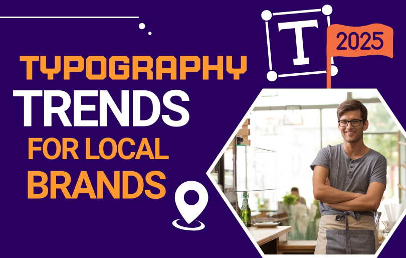
How Typography Trends in 2025 for Local Brands Can Elevate Your Marketing!
In 2025, the world of typography is set to witness a transformative shift, presenting local brands with unparalleled opportunities to enhance their marketing strategies. With consumers inundated by visual stimuli, effective typography isn’t just about aesthetics—it’s a vital element that communicates your brand’s message and personality. As we explore the typography trends shaping the future, you’ll discover innovative fonts, bold color choices, and dynamic layouts that can help your brand stand out in a crowded marketplace. Embracing these trends will not only elevate your marketing efforts but also forge a deeper connection with your audience. Join us as we dive into the exciting world of typography trends in 2025 and uncover how aligning your brand with these trends can lead to increased engagement, recognition, and growth. Your future success in marketing begins with the font you choose—let’s make it a memorable one!
Why Typography Matters in Local Brand Marketing

Typography is more than just the art of arranging type—it’s a critical component of a brand’s visual identity. For local brands, typography plays a significant role in conveying the essence and personality of the business. It can evoke emotions, create a sense of trust, and influence how customers perceive the brand. In a marketplace where local businesses compete fiercely for attention, the right typography can set a brand apart and make a lasting impression.
The importance of typography lies in its ability to communicate messages effectively. Every font choice, size, and style sends a subtle message to the audience. For instance, a playful and whimsical font might suggest a fun and approachable brand, while a sleek and modern typeface could convey professionalism and innovation. By carefully selecting typography that aligns with the brand’s values and voice, local businesses can create a cohesive and compelling brand identity that resonates with their target audience. In Adzeem, typography is more than just arranging letters — it’s the cornerstone of our brand’s visual identity design service that shapes your client’s first impressions.
Moreover, typography influences readability and user experience. Clear and legible fonts ensure that the audience can easily read and understand the information presented. This is especially crucial in marketing materials such as websites, social media posts, and advertisements. Poor typography choices can lead to confusion and disengagement, whereas thoughtful typography can guide the reader’s eye and enhance the overall aesthetic appeal. As we move into 2025, the evolving trends in typography offer local brands exciting opportunities to refine their marketing strategies and connect more deeply with their customers.
Key Typography Trends in 2025 for Local Businesses

Typography trends in 2025 are redefining how local businesses communicate their brand identity. From retro revivals to custom typefaces and bold, statement fonts, these trends offer exciting opportunities for local brands to stand out and connect with their audiences more effectively.
1. Vintage Fonts Make a Powerful Comeback
Nostalgia is influencing design in 2025, and vintage typefaces are at the forefront. These retro styles evoke warmth and familiarity, helping local businesses build emotional connections and trust with their communities.
2. The Rise of Custom and Bespoke Typefaces
Personalized branding is key in a competitive market. Custom fonts allow local businesses to express individuality and create a visual identity that’s truly one-of-a-kind and memorable.
3. Bold Typography for Attention-Grabbing Design
Big, bold fonts aren’t just eye-catching—they command attention. Local brands can use oversized type to emphasize calls to action and boost visual impact across both digital and print materials. For broader design context, review the top 2024 web design trends to see how typography plays with layout, motion, and UI pattern.
4. Minimalist Typography for Clean Brand Messaging
Simplicity speaks volumes. Clean, minimalist typefaces help businesses deliver their message clearly and professionally while maintaining a modern, approachable brand presence.
5. Typography That Reflects Local Culture and Identity
Local flavor matters. Choosing fonts that reflect the culture, history, or aesthetics of your community can make your branding more relatable and emotionally resonant.
Staying on top of typography shifts is as crucial as following cutting-edge web design trends to keep your visuals fresh.
Fonts That Tell a Story: Choosing the Right Typeface for Your Local Audience

Selecting the right typeface for your local audience is a nuanced process that goes beyond aesthetic preferences. It involves understanding the demographics, preferences, and cultural context of your target market. The typeface you choose should resonate with your audience and reflect the values and personality of your brand. For instance, a local bakery targeting families and children might opt for a playful and whimsical font, while a tech startup might choose a sleek and modern typeface to convey innovation and professionalism. Small local teams should align type choices with page structure; the essentials of web design for small businesses explains how hierarchy, spacing, and copy length influence font selection.
Storytelling through typography is an effective way to create an emotional connection with your audience. Each typeface has its own unique character and can evoke specific emotions and associations. Serif fonts, for example, are often perceived as traditional and trustworthy, making them suitable for brands that want to convey reliability and heritage. Sans-serif fonts, on the other hand, are seen as modern and clean, making them ideal for brands that prioritize simplicity and contemporary aesthetics. By understanding the personality traits of different typefaces, local businesses can choose fonts that align with their brand narrative and resonate with their audience.
Additionally, the context in which the typeface will be used is crucial. Different marketing materials may require different font choices to ensure readability and impact. For example, a typeface that works well on a website might not be suitable for a printed brochure or a social media post. It’s important to consider factors such as font size, weight, and spacing to ensure that the typeface remains legible and effective across various platforms. By carefully selecting typefaces that suit the context and purpose of each marketing material, local brands can create a consistent and cohesive visual identity.
Colorful Typography: How Color Trends in 2025 Influence Brand Engagement

Color plays a central role in typography, shaping how audiences perceive text and the emotions it conveys. In 2025, typography trends are embracing bold and vibrant palettes that demand attention, convey energy, and add personality to brand communication. For local businesses, incorporating these color trends into their typography can strengthen engagement, make messaging more memorable, and create visually rich brand experiences. Color and type work together; if you’re choosing palettes, this guide to color theory in web design helps you pair hues with type that reads well.
1. Gradients and Multi-Colored Typefaces: Adding Energy and Movement
One of the standout trends in 2025 is the use of gradient and multi-colored typefaces to inject life into text. Gradients create a sense of depth and movement, offering a modern, forward-thinking aesthetic ideal for brands seeking to project innovation. Multi-colored typefaces bring a playful, creative flair, helping messages pop in visually crowded spaces. For local businesses, these styles can build a dynamic, lively brand image that captures attention instantly.
2. Contrasting Colors for Emphasis and Visual Hierarchy
Using complementary or sharply contrasting colors in typography is another effective strategy for guiding the reader’s focus. This approach is especially powerful in marketing materials, where important elements such as headlines, calls to action, and key selling points need to stand out. By intentionally pairing colors that command attention, brands can ensure that their most critical messages are both visible and memorable.
3. Harnessing the Psychology of Color for Brand Alignment
Color choice in typography is not just a design decision—it’s a psychological tool. Different hues evoke distinct emotions and associations, and understanding these effects allows brands to align their typography with their identity. For example, blue conveys trust and professionalism, making it a go-to choice for corporate communication, while yellow radiates optimism and energy, perfect for brands aiming to project positivity. By leveraging the emotional power of color, local businesses can connect with audiences on a deeper level while reinforcing their values. Color-heavy headlines must still scale; consider the importance of responsive web design so gradients and contrast remain accessible on mobile.
Examples of Local Brands Winning with Typography in 2025

Local brands are experimenting boldly with type to build memorable identities and connect with their audiences. Below are clear examples of how different businesses used typography strategically in 2025 to strengthen brand recognition and customer engagement.
Vintage Typeface Coffee Shop
A local coffee shop leaned into the vintage typeface trend, applying a retro-inspired font across its logo, signage, and packaging. The chosen typography created a nostalgic, welcoming atmosphere that resonated with customers and reinforced the shop’s cozy, artisanal vibe. This consistent, authentic approach helped the business stand out on busy streets and build a loyal local following.
Bespoke Typeface for a Local Boutique
A neighborhood boutique invested in a custom typeface crafted to reflect its unique personality—elegant, intricate letterforms that communicated sophistication and exclusivity. By using the bespoke font consistently across its website, social posts, in-store displays, and product tags, the boutique created a high-end, cohesive visual identity that differentiated it from competitors and attracted discerning shoppers.
Bold, Expressive Typography for a Tech Startup
A local tech startup used oversized, attention-grabbing type in ads and on its website to project confidence and innovation. Paired with a vibrant color palette, the bold typography amplified the brand’s energy and increased visibility across digital channels. This design choice reinforced the startup’s positioning as forward-thinking and helped it cut through the noise in a crowded market.
These examples show that typography is more than decoration—it’s a strategic tool. Whether through vintage charm, custom craftsmanship, or bold expression, choosing a type approach that aligns with brand values and audience expectations can create stronger recognition, clearer messaging, and deeper emotional connection.
Final Thoughts: Aligning Typography Trends with Your Local Brand’s Voice
As we look ahead to 2025, the evolving trends in typography present local brands with exciting opportunities to elevate their marketing strategies. Typography is more than just a design element—it’s a powerful tool for communication and storytelling. By embracing the latest trends in fonts, color, responsiveness, and accessibility, local businesses can create compelling and memorable visual identities that resonate with their audience.
It’s important for local brands to be intentional and strategic in their typography choices. This involves understanding the brand’s values, personality, and target audience, and selecting typefaces that align with these elements. By creating a cohesive visual identity that combines typography with other design components, brands can build recognition and trust, enhancing their overall marketing efforts. To stay regionally relevant, skim graphic design trends in Maryland for 2025 and adapt type choices to local aesthetics.
Moreover, local brands should be mindful of common typography mistakes and strive for clarity, consistency, and cultural relevance. Thoughtful typography choices can enhance readability, user experience, and engagement, ultimately driving brand growth and success. As we move into the future, the font you choose can make a significant impact on your brand’s perception and effectiveness. By aligning typography trends with your local brand’s voice, you can create a memorable and impactful brand identity that stands out in a crowded marketplace.