Creating a Seamless User Experience: The Key Elements of Mobile-Friendly Web Design
In today’s digital landscape, mobile-friendly web design is no longer just a nice-to-have feature; it’s a necessity. With more and more people accessing the internet on their smartphones and tablets, businesses must ensure their websites provide a seamless user experience across all devices. But what does it take to create a truly mobile-friendly website?
In this article, we explore the key elements of mobile-friendly web design and how they can enhance the overall user experience. From responsive layouts to optimized images and intuitive navigation, we’ll cover the techniques and best practices that can make your website shine on any screen size.
At [Brand Name], we understand the importance of mobile-friendly web design in attracting and retaining customers. Our team of experts has extensive experience in crafting visually appealing and conversion-optimized websites that work seamlessly across all devices. So whether you’re a small business owner or a multinational corporation, join us as we delve into the world of mobile-friendly web design and unlock the potential of this essential element in your online strategy.
Embrace a purpose-driven web design process to ensure your site’s mobile-friendliness aligns with your brand’s mission and user needs.
The Importance of Mobile-Friendly Web Design
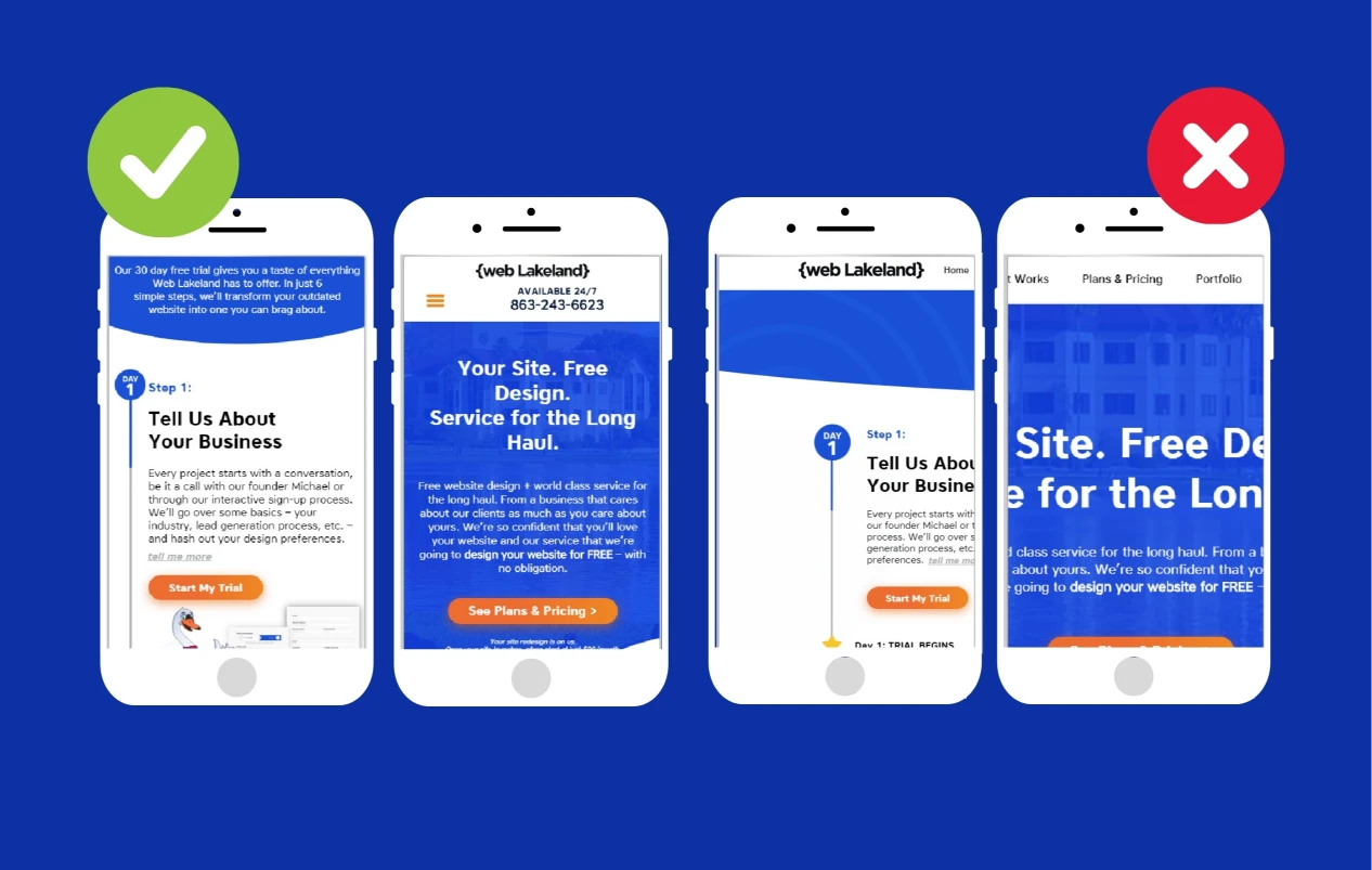
In today’s fast-paced world, people are constantly on the move and rely heavily on their mobile devices to access information and make purchases. As a result, having a mobile-friendly website has become crucial for businesses to stay competitive and meet the expectations of their users.
A mobile-friendly website not only provides a better user experience but also improves your search engine rankings. With Google’s mobile-first indexing, websites that are optimized for mobile devices are more likely to rank higher in search engine results. This means that if your website is not mobile-friendly, you may be missing out on valuable organic traffic and potential customers.
Furthermore, a mobile-friendly website helps to build trust and credibility with your audience. When users visit a website that is not optimized for their device, they are more likely to leave and look for alternatives. On the other hand, a website that loads quickly and displays properly on all screen sizes creates a positive impression and encourages users to stay longer and engage with your content.
By investing in mobile-friendly web design, you are not only catering to the needs of your users but also ensuring that your business stays relevant in today’s mobile-dominated world.
Key Elements of Mobile-Friendly Web Design
To create a truly mobile-friendly website, there are several key elements that you need to consider. These elements work together to provide a seamless user experience and ensure that your website is optimized for all devices.
Learn how our Maryland’s responsive web design services can transform your website into a mobile-friendly masterpiece.
1. Responsive Design and Its Benefits
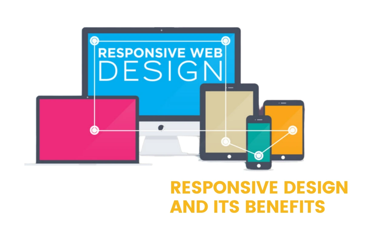
Responsive design is a fundamental element of mobile-friendly web design. It involves creating a website that automatically adjusts its layout and content to fit different screen sizes. With responsive design, your website will look and function seamlessly on smartphones, tablets, and desktop computers.
One of the main benefits of responsive design is improved usability. Users no longer have to pinch and zoom to read content or navigate through your website. Instead, they can easily interact with your site using touch gestures and have a consistent experience across all devices.
From a development perspective, responsive design also saves time and resources. Rather than creating separate websites for different devices, you can build and maintain a single website that adapts to different screen sizes. This streamlines the development process and ensures that your website is always up to date.
Discover the latest 2023 web design trends that are shaping the future of responsive design across various platforms.
2. Optimizing Page Load Speed for Mobile Devices
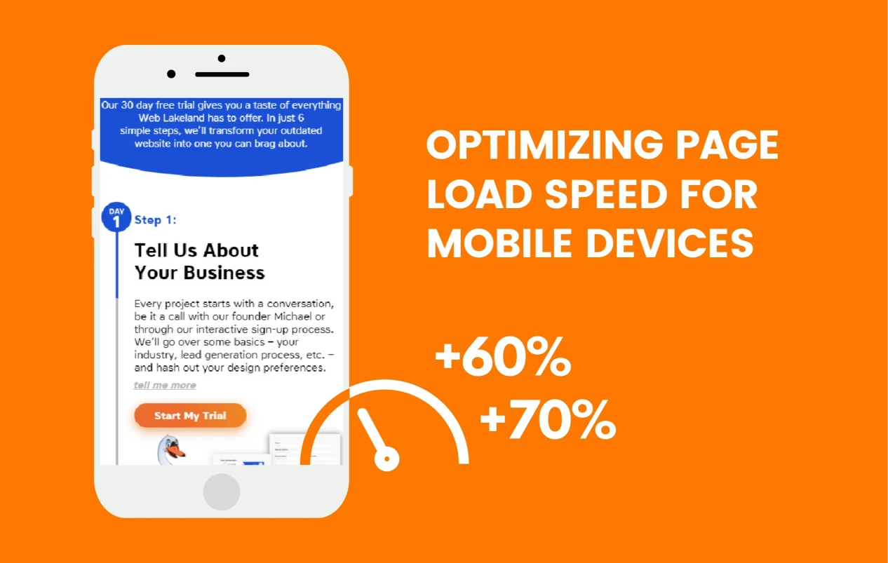
Page load speed is a critical factor in mobile-friendly web design. Users expect websites to load quickly, especially on mobile devices where internet connections may be slower or less stable. If your website takes too long to load, users are likely to abandon it and look for alternatives.
To optimize page load speed for mobile devices, there are several techniques you can implement. First, you should minimize the number of HTTP requests by combining and minifying CSS and JavaScript files. This reduces the amount of data that needs to be transferred from the server to the user’s device.
Second, you should optimize and compress images to reduce their file size without sacrificing quality. Large image files can significantly slow down your website, so it’s important to find the right balance between image quality and file size.
Finally, you should leverage browser caching to store static assets, such as images and CSS files, on the user’s device. This allows subsequent visits to your website to load faster as the browser doesn’t have to retrieve these assets from the server again.
By implementing these page load speed optimization techniques, you can ensure that your website loads quickly on mobile devices and provides a smooth user experience.
3. Mobile Navigation Best Practices
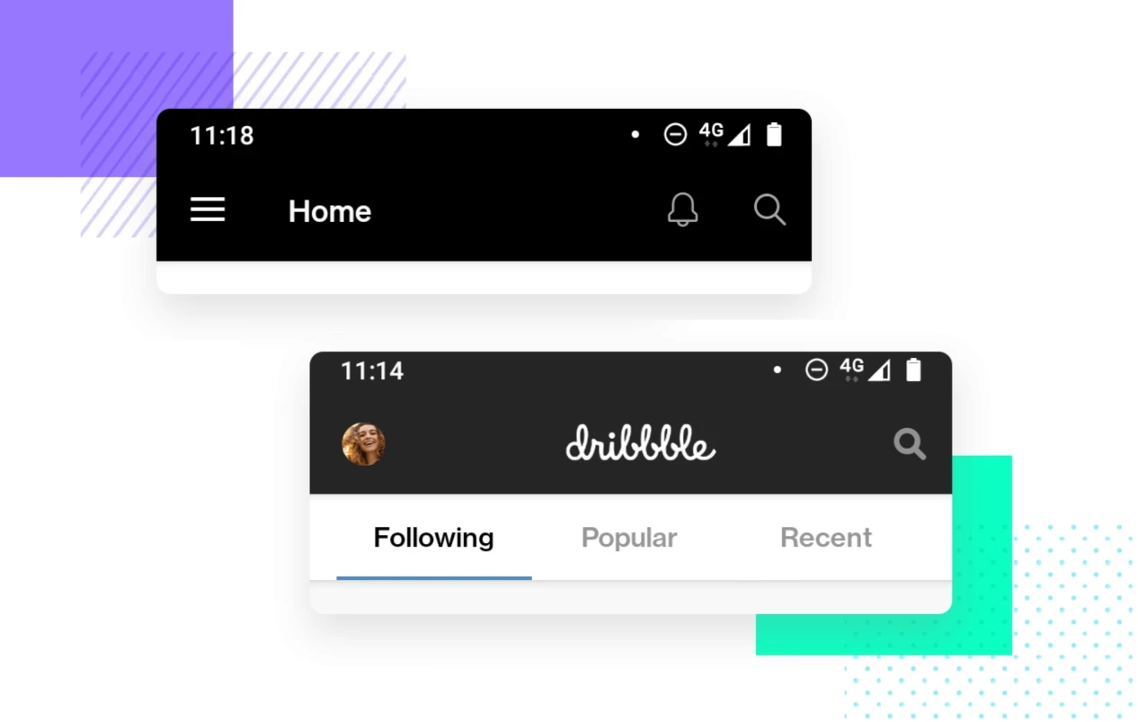
Navigation is a crucial aspect of mobile-friendly web design. Users should be able to easily find the information they’re looking for and navigate through your website without any confusion or frustration.
One of the best practices for mobile navigation is to use a hamburger menu. This is a collapsible menu icon that expands when clicked, revealing the navigation options. The hamburger menu saves screen space and allows users to access the navigation menu when needed.
Another important aspect of mobile navigation is to keep the menu items concise and organized. Mobile screens have limited space, so it’s important to prioritize the most important menu items and group related items together. This makes it easier for users to find what they’re looking for and reduces the need for scrolling.
Additionally, you should use clear and descriptive labels for your menu items. Avoid using jargon or ambiguous terms that may confuse users. Instead, use simple and familiar language that accurately represents the content of each page.
By following these mobile navigation best practices, you can ensure that users can easily navigate through your website and find the information they need.
4. Designing for Different Screen Sizes and Resolutions
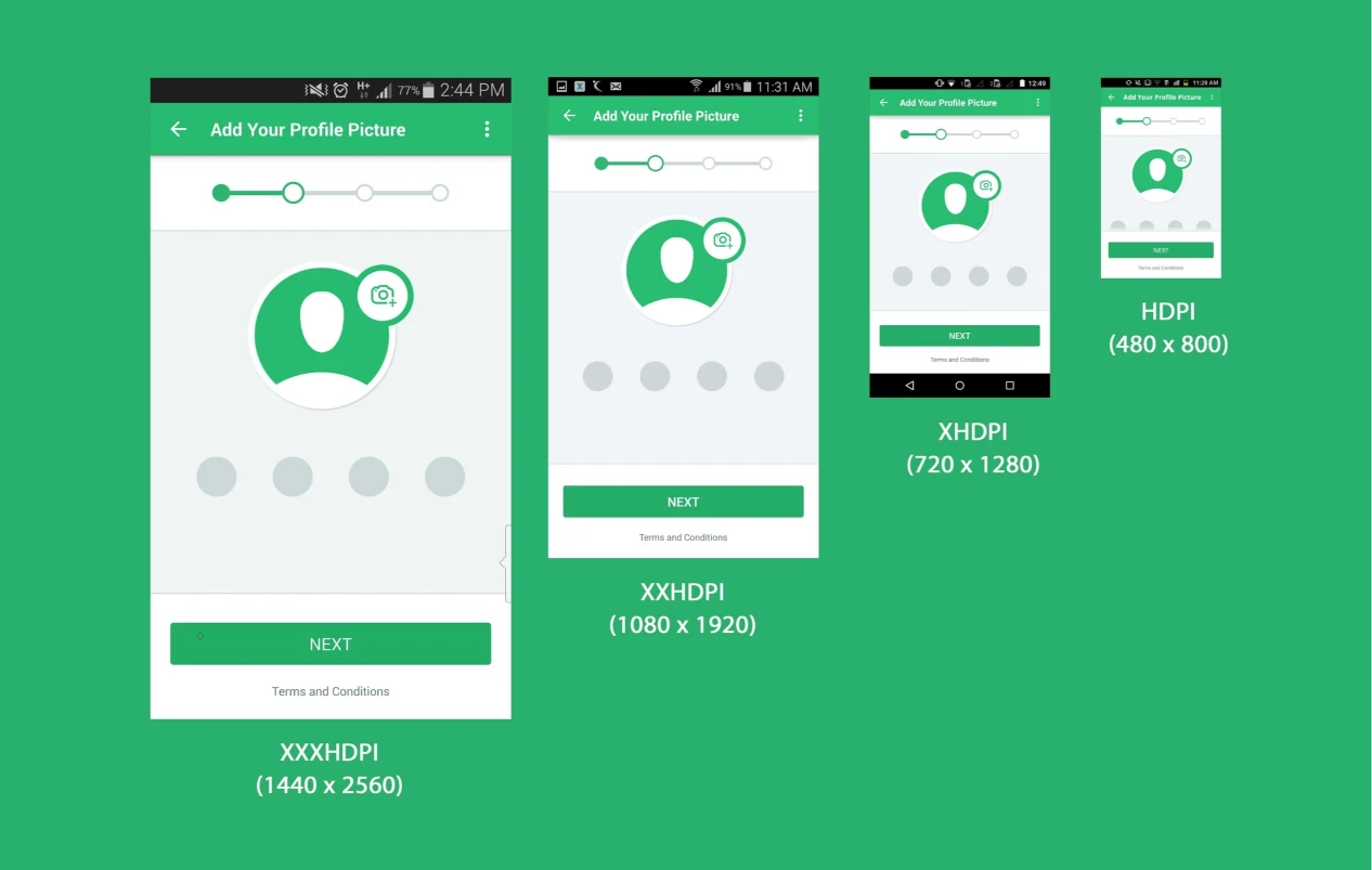
When designing a mobile-friendly website, it’s important to consider the wide range of screen sizes and resolutions that your users may have. From small smartphones to large tablets, your website should adapt to different devices and provide a consistent experience.
One approach to designing for different screen sizes is to use a grid system. A grid system allows you to divide your website’s layout into a series of columns and rows, which can then be rearranged based on the screen size. This ensures that your content is displayed in a visually appealing and organized manner across all devices.
Another consideration when designing for different screen sizes is the use of breakpoints. Breakpoints are specific screen widths at which the layout of your website changes. By defining breakpoints, you can optimize the layout and design for each screen size, ensuring that your website looks and functions seamlessly on all devices.
In addition to layout and design, you should also take into account the size of interactive elements, such as buttons and links. These elements should be large enough to be easily tapped with a finger, without accidentally touching neighboring elements. This improves the user experience and prevents frustration when interacting with your website.
By designing for different screen sizes and resolutions, you can create a mobile-friendly website that looks great and functions seamlessly on any device.
5. Implementing Touch-Friendly Elements
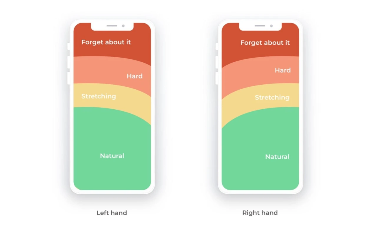
Mobile devices are primarily operated through touch gestures, so it’s important to ensure that your website’s interactive elements are touch-friendly. This means that buttons, links, and other interactive elements should be easy to tap and respond quickly to touch input.
To implement touch-friendly elements, there are several best practices you can follow. First, you should ensure that interactive elements have enough spacing between them. This prevents accidental taps and makes it easier for users to select the intended element.
Second, you should use appropriate sizes for touch targets. The recommended minimum size for touch targets is 48 pixels by 48 pixels. This ensures that users can easily tap on buttons and links without having to zoom in or use precision movements.
Furthermore, you should provide visual feedback when users interact with touch-friendly elements. This can be done through animations, color changes, or other visual cues that indicate the element has been tapped or activated. Visual feedback enhances the user experience by providing clear indications of user actions.
By implementing touch-friendly elements, you can create a mobile-friendly website that is easy and intuitive to use on touch-enabled devices.
6. Mobile-Friendly Content and Typography
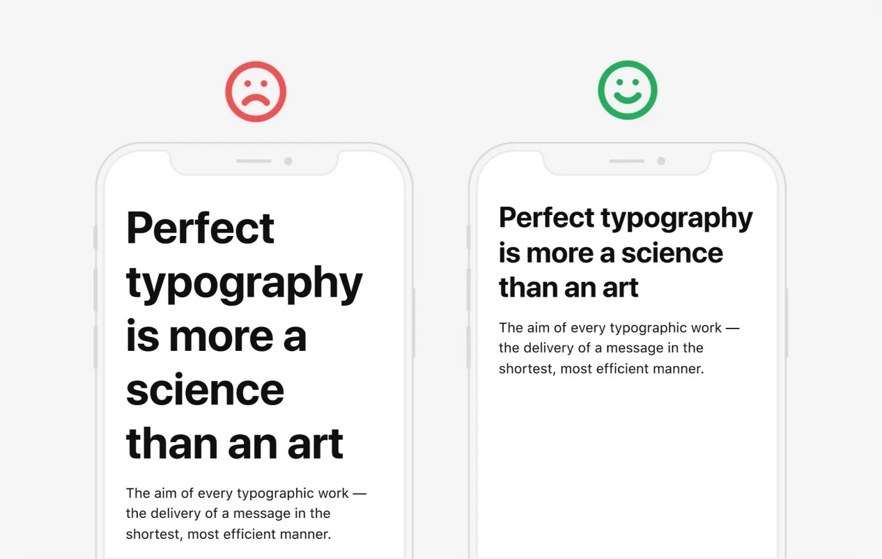
In addition to the visual aspects of mobile-friendly web design, it’s also important to consider the content and typography on your website. Mobile users have limited screen space, so it’s crucial to present your content in a concise and easily digestible manner.
One way to optimize content for mobile devices is to use a mobile-first approach. This involves designing and prioritizing content specifically for mobile screens, and then expanding it for larger screens. By starting with the mobile layout, you ensure that your content is focused and relevant to mobile users.
Additionally, you should use clear and legible typography that is easy to read on small screens. Avoid using small font sizes or decorative fonts that may be difficult to read. Instead, opt for a clean and readable font that is visually appealing and enhances the overall user experience.
Furthermore, you should break up your content into smaller paragraphs and use subheadings to improve readability. Mobile users tend to skim through content, so it’s important to present information in bite-sized chunks that are easy to digest. Subheadings help users quickly navigate through your content and find the information they’re looking for.
By optimizing your content and typography for mobile devices, you can ensure that users can easily consume and engage with your website’s content.
7. Testing and Optimizing Your Mobile-Friendly Design
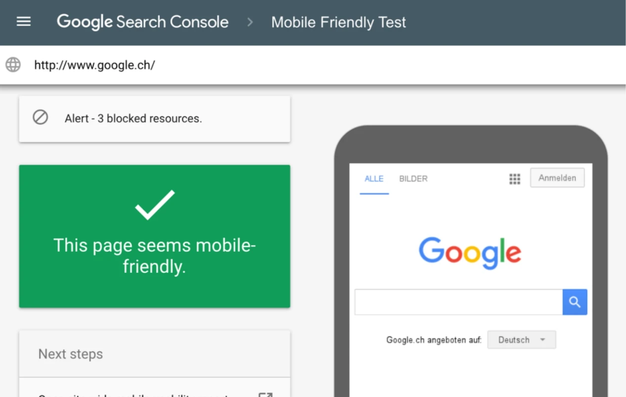
Once you have implemented the key elements of mobile-friendly web design, it’s important to test and optimize your design to ensure it provides a seamless user experience.
First, you should test your website on a variety of mobile devices and screen sizes to ensure it looks and functions as intended. This includes testing on different operating systems, browsers, and device orientations. By testing on real devices, you can identify any issues or inconsistencies and make the necessary adjustments.
In addition to device testing, you should also test your website’s performance on mobile networks with limited bandwidth. This helps to identify any bottlenecks or performance issues that may affect the user experience. Tools like Google’s PageSpeed Insights can provide insights and recommendations for improving your website’s performance on mobile devices.
Furthermore, you should gather feedback from your users and make iterative improvements based on their input. Conducting user testing and surveys can provide valuable insights into how users interact with your website and what areas can be improved. By incorporating user feedback into your design, you can create a mobile-friendly website that meets the needs and expectations of your audience.
By continuously testing and optimizing your mobile-friendly design, you can ensure that your website provides a seamless user experience and stays ahead of the competition.
Explore the critical role of UX and SEO collaboration in enhancing mobile web design for better user experiences and search engine visibility.
Conclusion
In today’s mobile-dominated world, creating a seamless user experience on all devices is essential for the success of your website. By implementing the key elements of mobile-friendly web design, such as responsive layouts, optimized images, intuitive navigation, and touch-friendly elements, you can create a website that looks great and functions seamlessly on any screen size.
At Adzeem, we specialize in crafting visually appealing and conversion-optimized websites that work seamlessly across all devices. Our team of experts understands the importance of mobile-friendly web design in attracting and retaining customers. Whether you’re a small business owner or a multinational corporation, we can help you unlock the potential of mobile-friendly web design and elevate your online strategy.
Don’t miss out on the opportunities that a mobile-friendly website can bring. Invest in mobile-friendly web design today and provide a seamless user experience that keeps your audience engaged and coming back for more. Contact Us to get started on your mobile-friendly web design journey.
If you’re a small business aiming to thrive online, consider leveraging web design for small businesses to create a competitive, mobile-friendly site.

Bespoke Web Designs: Elevate Your Online Presence | Adzeem
[…] planning a website’s layout, understanding the key components of responsive web design ensures your site works seamlessly on all […]
September 21, 2024